
Modernizing Bureaucratic Government Sites.
The Problem:
I interned at the Office of Assemblymember Brian Barnwell for about a year. For the first three months, I was a legislative affairs liaison. I was required to conduct outreach to other assemblymembers to persuade them to cosign bills. I also interacted with many constituents and was good friends with interns and employees who worked heavily with constituents. Through this experience, I realized that government websites, especially on the local level are super clunky and awkward to navigate, which makes it difficult for both employees and constituents to navigate alike. My question: How might we modernize a bureaucratic government website and make it easier for constituents to use.
Skills:
Interviewing, Secondary Research, Affinity Mapping, Personas, Journey Maps, User Flows, Wireframing, Prototyping, Visual Design
Software:
Illustrator, InVision
Research
I began my research by first researching different local government websites. I looked at a lot of nyc.gov’s websites, and was considering creating a new design system for them, but I ultimately decided to revamp the New York State Assemblymembers’s websites. Every New York State Assemblymember’s website follows the same very old and outdated template. This makes them all equally awkward to navigate. Because I interned at the Office of Assemblymember Brian Barnwell, I decided to focus on his site in particular, because I was familiar with the goings on at his office and in his district.
After this, I interviewed several old coworkers of mine about what they liked/disliked about the website. They told me the main problems with it were as follows: it’s outdated, aesthetically displeasing with blurry images and a gross color scheme. It’s also really difficult to find information on the site. Finding the actual text of bills and who voted for what is quite difficult and researching who’s on what committee can also prove quite tedious. They liked the content of the website. The site does have a lot of good information on it - it’s just a matter of finding it. People emphasized to me that having a transparent and simple to use website is super important for government agencies.
Below is the original and current site:

Wireframing
Before I started wireframing the new site, I created a sitemap of the original site, which is below.

When looking at this site map, I realized there were just way too many tabs, and a lot of this could be easily condensed. So I put all of the content under about in the about section. I thought that I would put any information the assemblymember wanted their constituents to know under newsroom, and things related legislation and committees would simply fall under policy. I also toyed with the idea of having an events page. I remembered from working at the office that assemblymembers would often have events and would only post about it on social media. I thought it would be good to also put these events on their website. And of course, I left contact as it was.

I then began wireframing. Below is an early hand-drawn wireframe. I often find it helpful to use pen and paper before making something digitally - I like being able to allow my thoughts to flow in an unorganized manner, and I find that paper is a great medium for this

Below is an example of a wireframe I worked on. I improved it after getting feedback from my professors and classmates. I originally wanted the logo to have all of the neighborhoods that the district encompassed next to the assemblymember’s name but often there would be too many to list, and it would just cause more confusion because some neighborhoods were part of multiple districts.

Visual Design
I wanted to bring the website into the 21st century, while also making the website feel official and professional, as well as making it feel accessible and easy to use for constituents. I tried out a purple and yellow combination which was pulled from Kamala Harris’s campaign. In the end, I kept a red, white and blue theme to keep the American feeling, but made the red more on the pink side to contrast more brightly with the blue so that it would feel more modern.


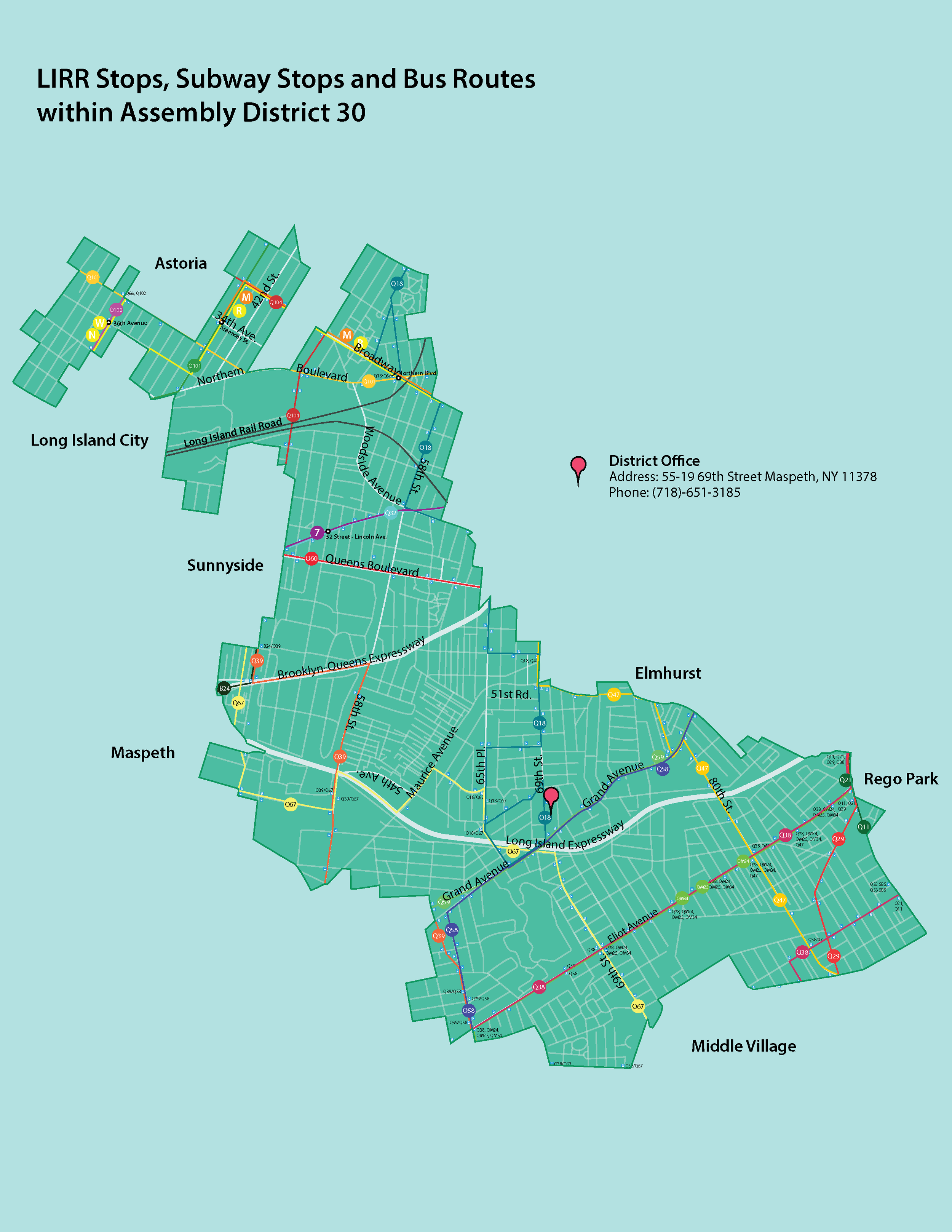
I was also considering incorporating these maps I drew in Adobe Illustrator when I was a graphic design intern at Assemblymember Brian Barnwell’s. These maps indicate every single bus, subway and LIRR stop that goes through the district. They are now used for intern orientation, in order to help new interns and employees to become more familiar with the district.

For the typography on the website redesign, I used a combination of Public Sans, which is the official font of the United States Federal government, and Playfair Display. I chose a serif font because government documents and websites tend to lean towards serif as a font of choice, and when I think of government, I imagine serif fonts because a serif feels more traditional, official and academic. I paired it with a sans serif because it is important for the government to espouse feelings of transparency, forward-thinking and clarity, and I think a sans-serif font can support these values, as well as add to the modern feeling of the site.
Below are some typography experiments.

Final Prototype
Below is a mock-up of the final prototype. On the homepage, I included important information such as the district map, updates, upcoming events and the office contact info. Under the about page I put a nice picture of the assemblyman with his bio. Under policy, I listed the bills that he’s currently trying to pass in the assembly, and made an easier way to read the text of the bill. I also provided quick summaries of the bill. Under newsroom, I compiled press releases, news articles and statements from the assemblymember. Events just lists all of the upcoming events, and contact includes a form for constituents to fill out a complaint online, or call the office directly.
To interact with the prototype, click here.

What I Learned
This project was my first complete redesign of a website, so I learned a lot from this process, such as creating cohesive webpages, and making information easy to read and find. I learned how to use InVision on my own. I also learned how to play with logos and create moodboards.