Geronimo! - Transit Made Faster
The Problem:
Navigating the MTA can be rough. Unexpected delays, overcrowding, over-policing, uncleanliness, sweltering/freezing temperatures, and general wayfinding issues plague New Yorkers, commuters and tourists alike. My question: How might we create a better transit experience for New Yorkers and tourists alike?
Skills:
Interviewing, Secondary Research, Affinity Mapping, Personas, Journey Maps, User Flows, Wireframing, Prototyping, Visual Design
Software:
Sketch, Adobe XD, Illustrator
Research
I began my research by searching for articles relating to the pros/cons of the New York City subway system. I found many listing the various frustrations of navigating the MTA as a tourist, as well as a commuter going through their day to day. A common complaint was crowding.


I interviewed 7 people who have used the MTA - 3 Native New Yorkers, 2 people who moved to New York for school in the last few years, and 1 person from Connecticut who mainly uses Metro North. I took notes while conducting the interviews, and from these notes created an affinity map.

After creating the affinity map, I discovered 3 key insights:
1.) Many people are confused by the buses. When riders are lost on the bus, they feel lost.
2.) Cops make commuting unpleasant. One person said, “The over-presence of police in the subway actually makes me feel more unsafe.”
3.) The MTA’s inability to communicate delays/track work make commuting painful.
Empathy
To further understand the user, I created 3 personas, with an accompanying journey map for each user. The three categories of users were a native New Yorker, recent New Yorker (someone who moved to the city in the last few years) and tourist. I felt this represented and described most of the people who use the subway. Below are two examples of personas and their accompanying journey maps I created for this project. For the visual design, I was inspired by the MTA’s iconic subway map designs.


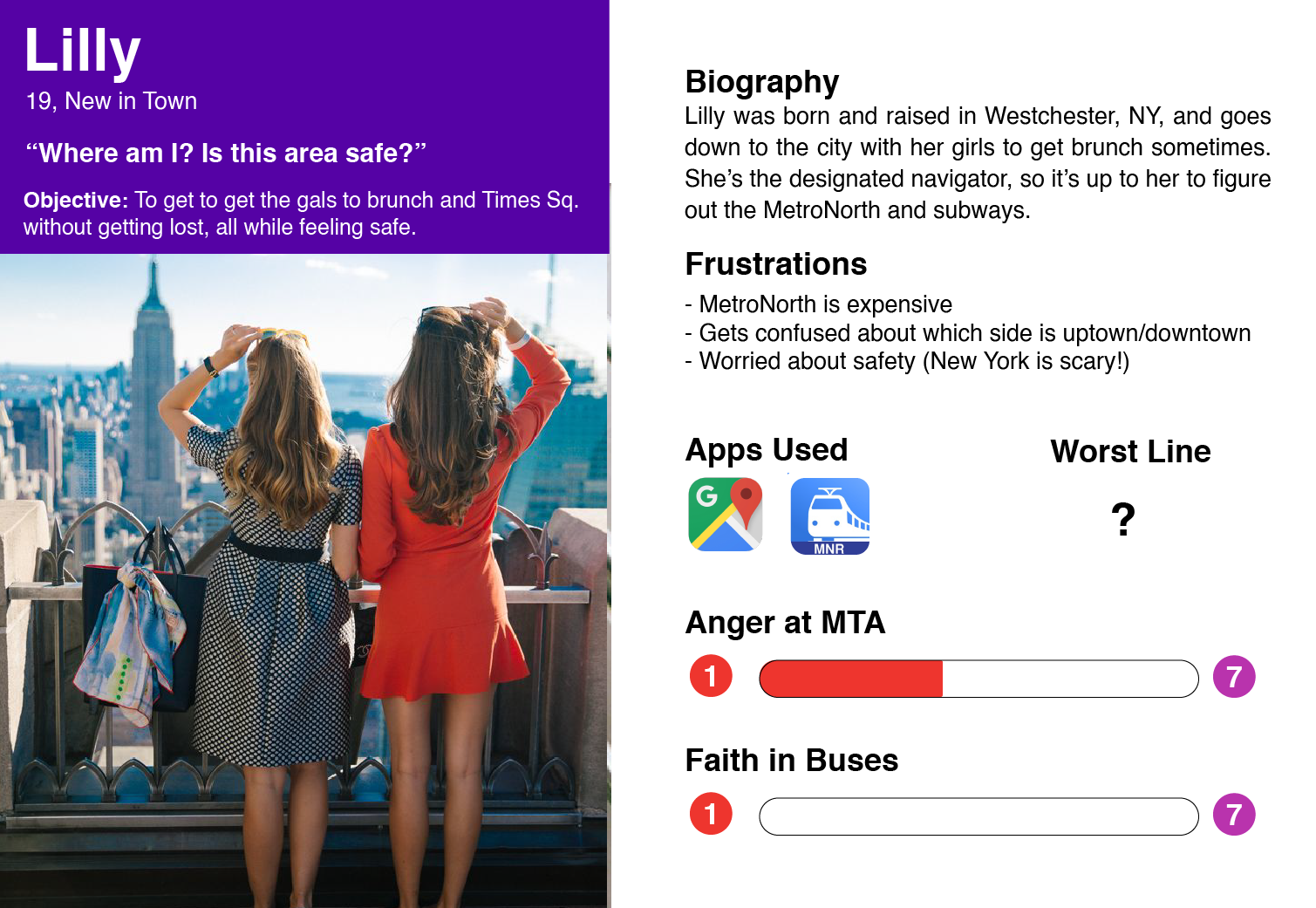

From creating these personas and journey maps, I understood that I wanted to create an easy-to-use experience for natives, commuters and tourists alike. I also realized from my insights that I wanted to address as many agitations with the MTA as possible with the app, while keeping it simple to use for multiple user groups.
Wireframing
After brainstorming, I came up with several ideas for my app. I knew that I wanted to create a way where users could see the status of the subway - when it was coming, if it was hot/cold, if it was clean, if there were police present, and if it was crowded. After speaking with several young women, and hearing their experiences on the train, I decided to create a panic button, which could be used to call for help, if a situation were to arise while taking the train. I also knew that the app should have some indication of which street corner one should enter the subway at for maximum efficiency. Finally, I wanted to create a sort of Survival Guide for tourists, which would answer questions like how to buy a MetroCard or how to use the subway.
I then began to wireframe these ideas. Below are the early wireframes I created in Sketch.
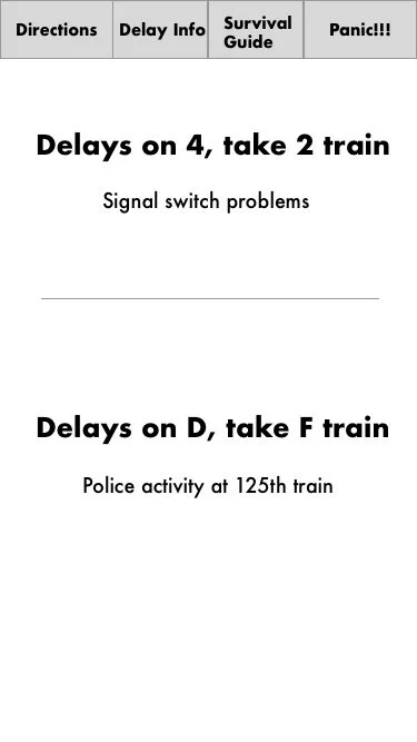


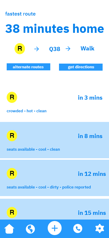
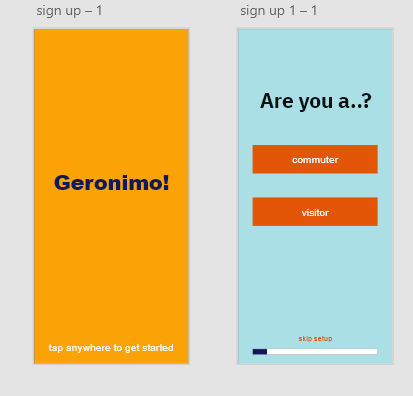
After getting feedback from potential users, I decided to create a form when you first signed in to customize your experience as either a frequent traveller to and around the city, or a tourist.Here are a few of the higher fidelity wireframes I created in Adobe :


Visual Design
After creating the wireframes, I moved on to the visual design. I created two separate mood boards. I had two separate ideas for the potential feel and color scheme of the app. The first idea I had was a warm, exciting adventurous feeling. I wanted the user to feel confident while using the app. The other color scheme I tried was one based in calm, serenity and a feeling of connection and harmony with one’s environment. I thought that this scheme could be cool to work with because so often when using the subway we feel frazzled and hectic, and I thought that a calm interface would be appropriate. Below are my the two mood boards I created in Illustrator.


I then tried these color palettes out in a few different ways. I ended up going with the orange/blue/red palette. I liked it’s funky look and I thought it made the app feel more fun and exciting than the green/pink/purple palette, whose tones were just a little too low-contrast.

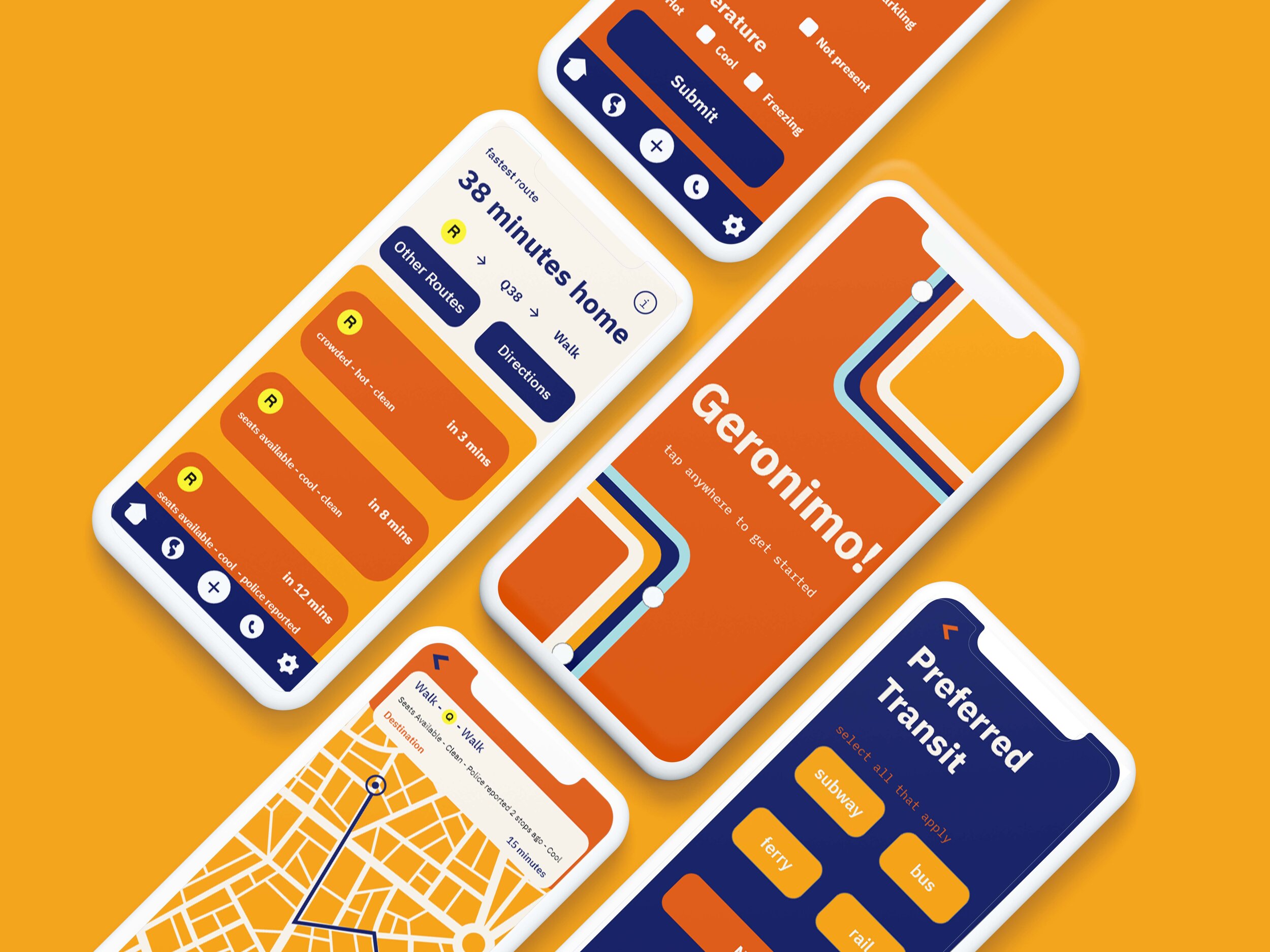
Final Prototype
The final prototype allowed for two separate user experiences via a startup survey taken by new users. If “commuter” is selected, the user will be able to input information about their commute, allowing their phone to send them push notifications reminding them when it’s time to leave for work in the morning, and when the next train is coming. It also would let them know towards the end of their workday how long it will take to get home. These features can both be accessed on the homepage. You can also explore alternative routes. If “visitor” is selected, the homepage would just show when the next trains are coming for the destination they inputted. This can also be done in commuter mode. Both modes allow for users to report conditions on the trains such as temperature, cleanliness, capacity/seats available and police presence. Both modes also have an emergency report button, so that in case a situation arises while taking transportation, help can be reached sooner rather than later. There are three options for emergencies: I feel unsafe, I am unwell, or someone else is unwell. By reporting one of these conditions, individuals will be able to get the help they need. Below is a mockup of the final prototype.
If you want to see the full interactive prototype, click here.

What I Learned
This project taught me a lot. It helped me practice my qualitative research skills, through conducting multiple user interviews. It taught me a lot about visual design, specifically regarding app/mobile design. While I don’t think the final prototype is perfect, it’s a massive improvement from previous app prototypes I’ve created in the past. The final prototype could have gone through more user testing. However, due to the pandemic in New York, I was unable to have potential users test it in the way I wanted to. I would have liked to have learned more about user testing, but was unable due to the time frame of the project. Despite this, I learned new editing software - I was introduced to Sketch, and became pretty comfortable with Adobe XD, which were big accomplishments. I look forward to working with these softwares again in the future.