Improving Madison Square Garden’s Website Navigation
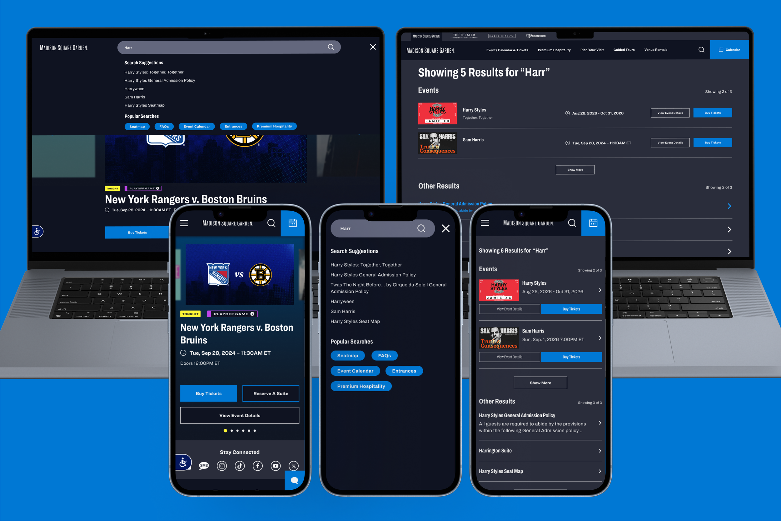
The Problem: MSG.com users were having difficulty searching the site for the events and information they wanted. How might we make the website easier to use and improve event findability?
Skills: Wireframing, User research, Competitive Analysis, UX Design, Prototyping
Software: Figma, UserTesting
Role: Product Designer, User Researcher, Prototyper
Improving Site Search
For the fiscal year 2025-26, my team had acquired a budget to work on the search functionality. Unfortunately, there was company restructuring which led to layoffs and other budget cuts, which left me without user research tooling, and as the only product designer at the company. Here was the state of the search experience before I began working on it.
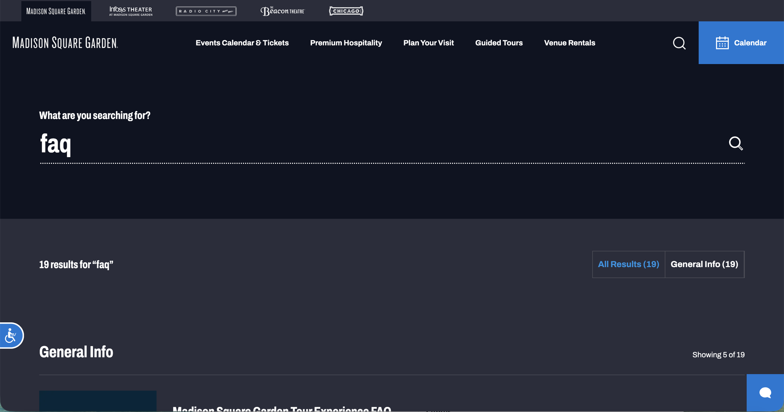
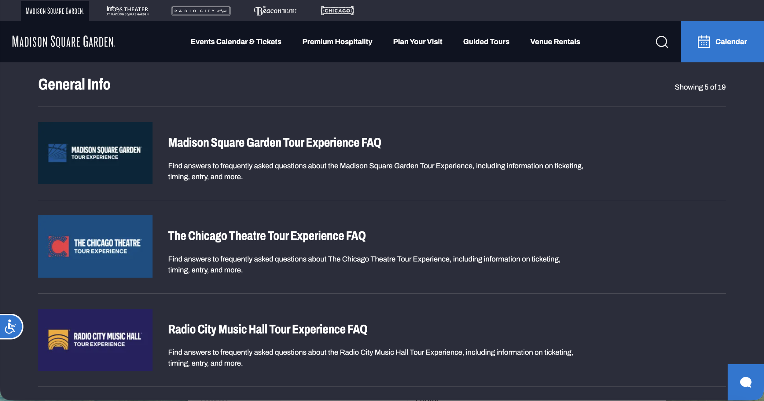
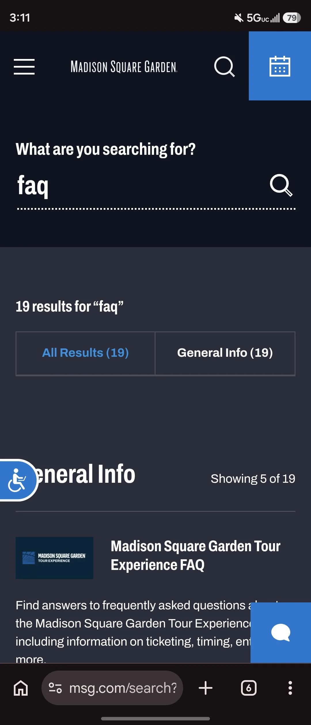
In lieu of user research, I worked with the stakeholders in the live entertainment marketing department and engineering to complete some competitive analysis to identify best-in-class examples of search that were relevant to our site. After we had worked so hard to create a great top nav experience, the problem we faced was how to get the search bar to overlay without sacrificing the top nav experience, especially on the desktop. We determined Nike and LiveNation to be good examples to use as inspiration for the new design. We identified other features that we wanted to include such as Nike’s popular search terms - we decided for our use-case these would be controlled by CMS and the marketing team could manually choose which pages they wanted to promote. We also liked the idea of having a type-ahead feature.
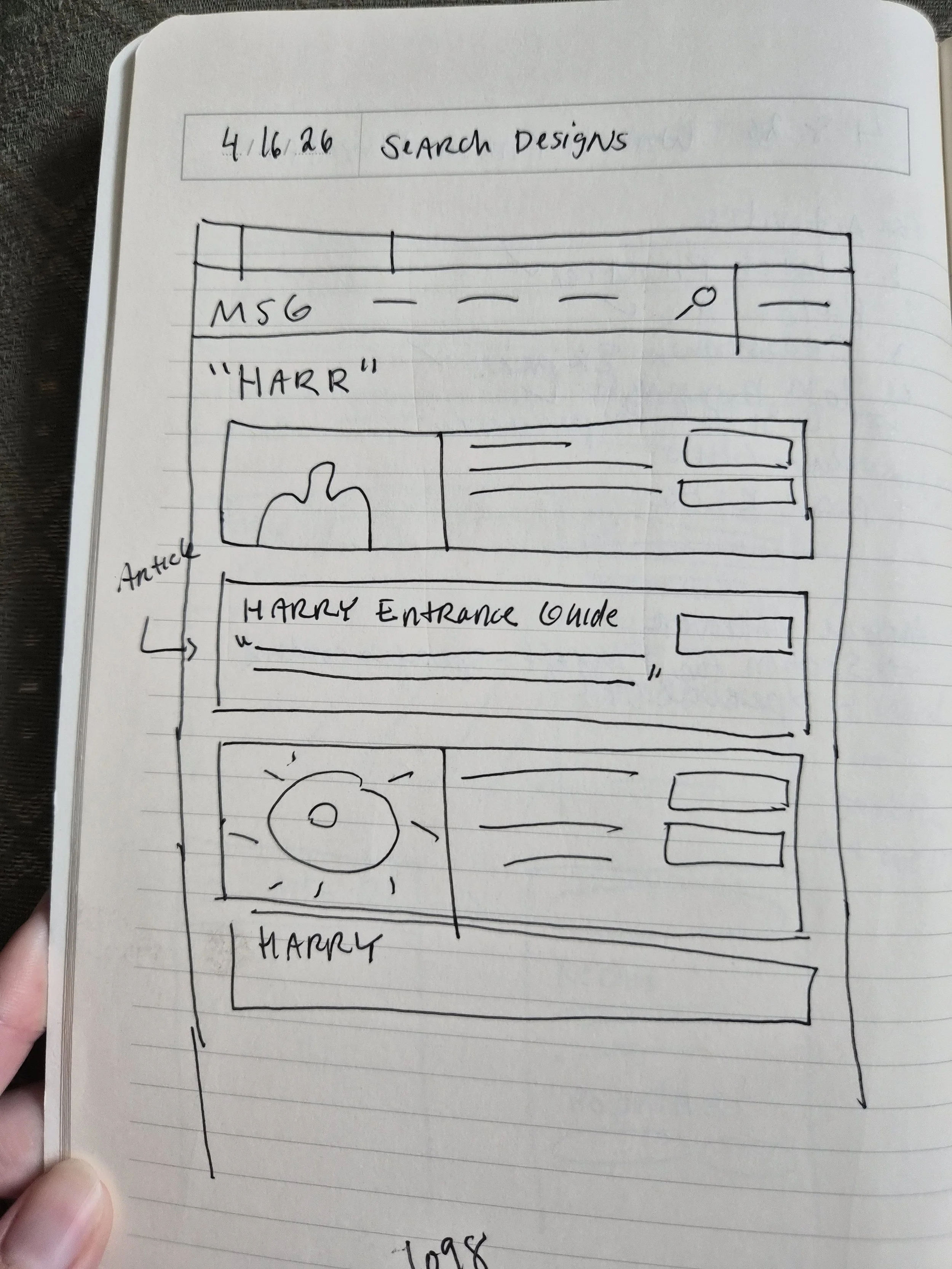
Once I got this information, I began sketching in my notebook. Here are some early sketches:
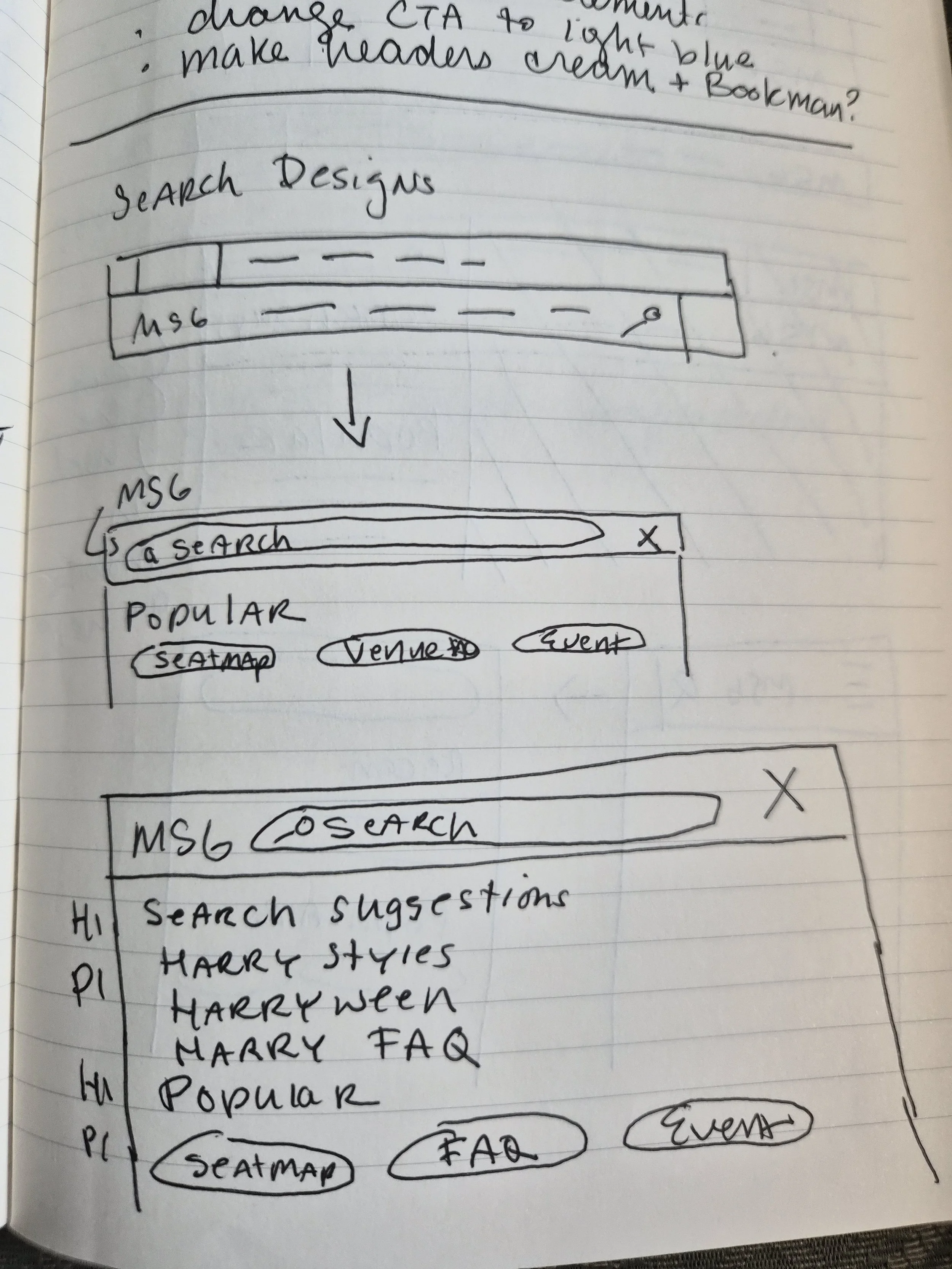
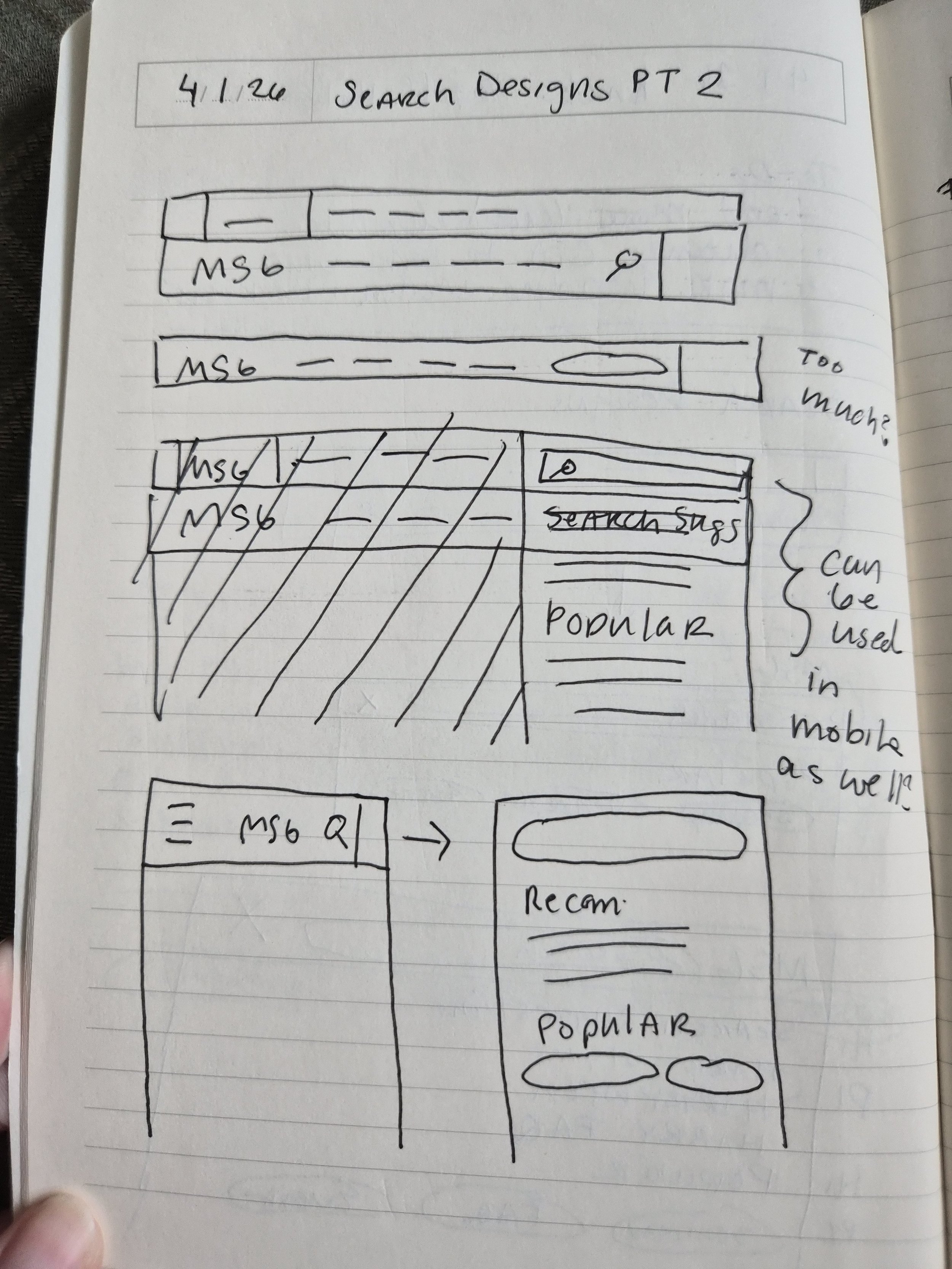
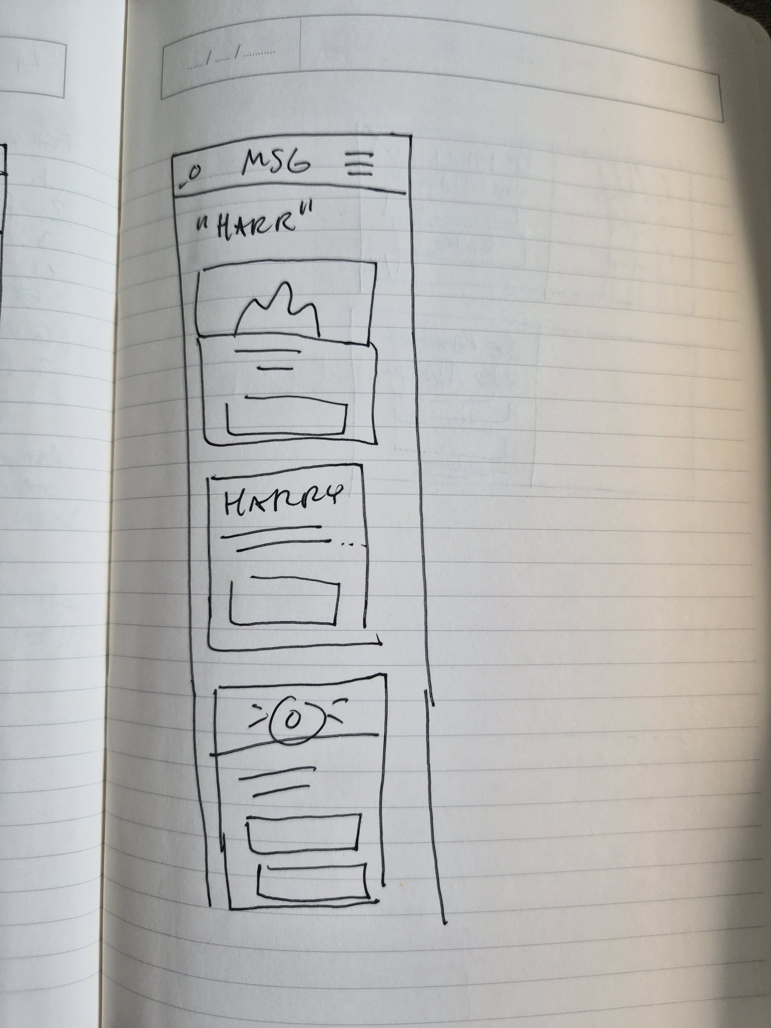
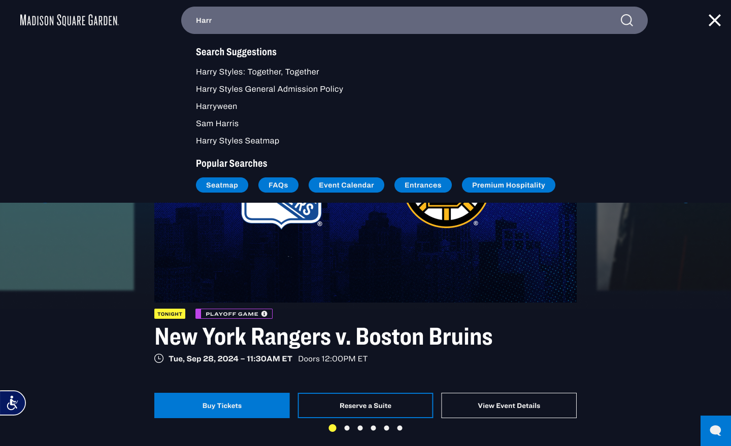
Then I went into Figma and began designing two different experiences for the search feature - one inspired by each example for desktop. I designed one option for mobile since its top nav was structured differently. I then prototyped each experience in Figma so the stakeholders could easily envision what the interactivity would look like.
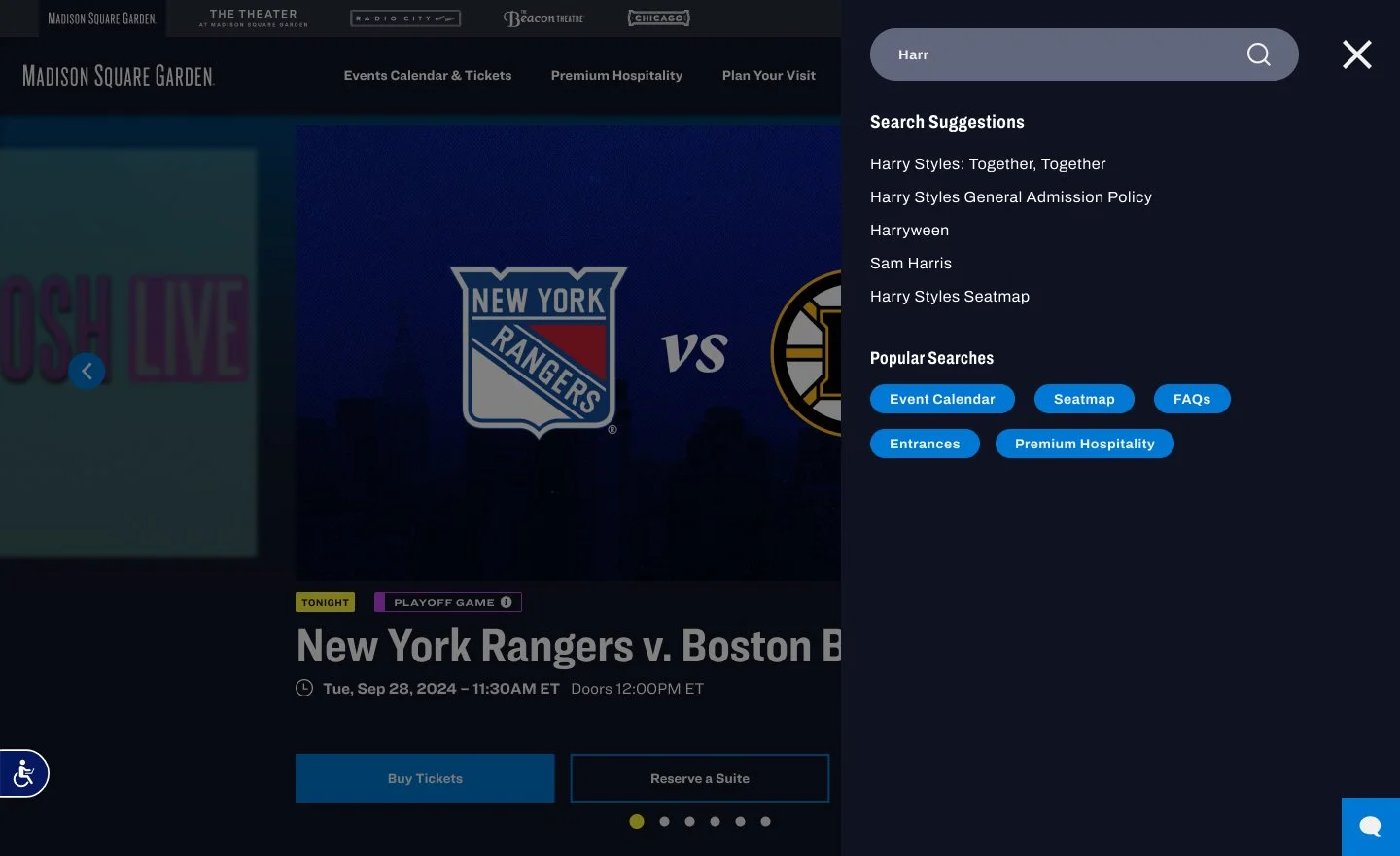
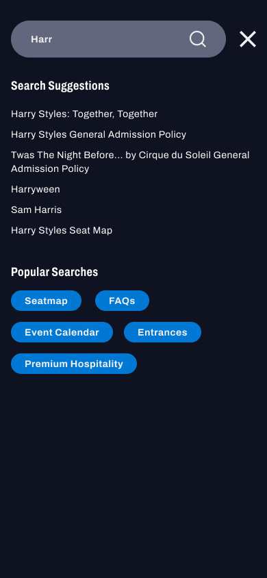
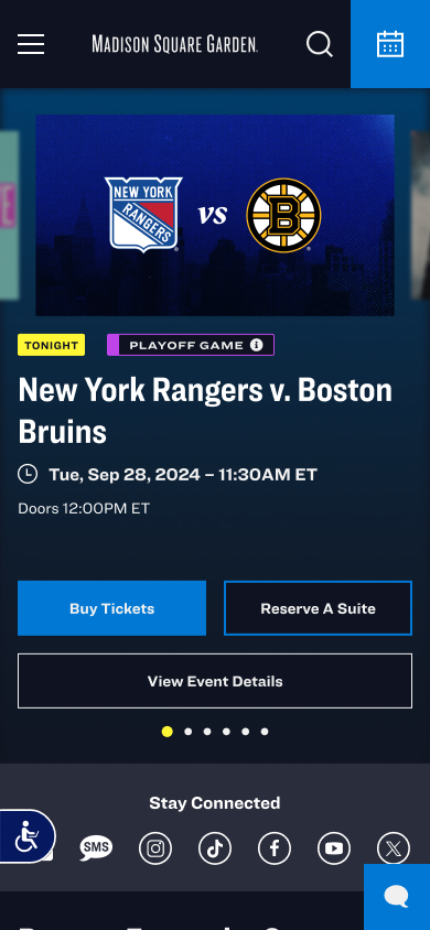
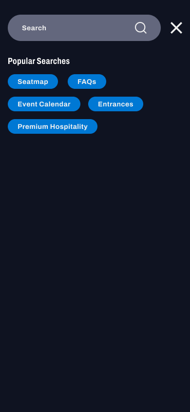
On the first view, the stakeholders preferred V1 as the direction for the search bar experience. They weren’t quite sold on the design of the search results though, and asked for some further exploration. I worked up a few more examples for what the search results could look like here:
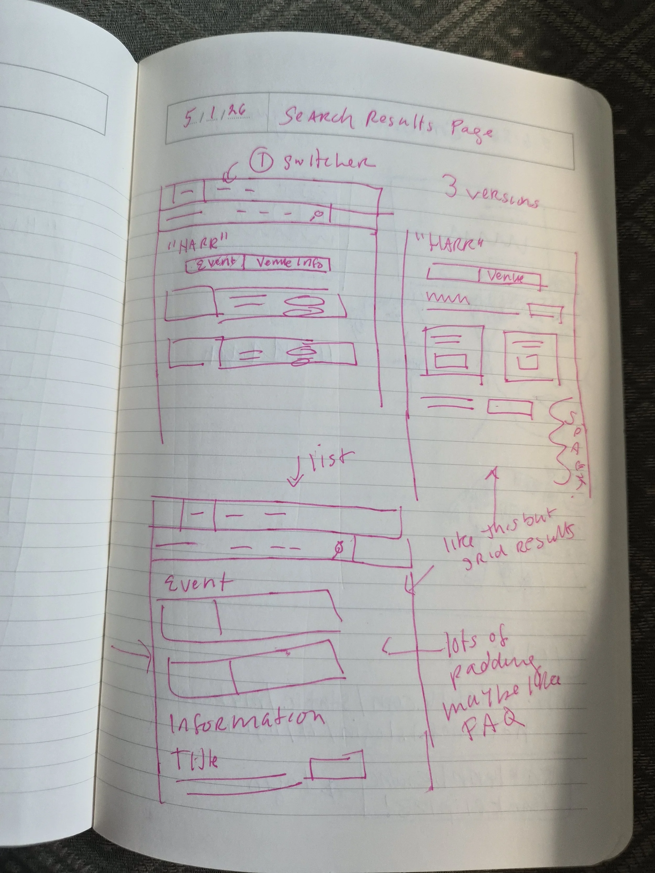
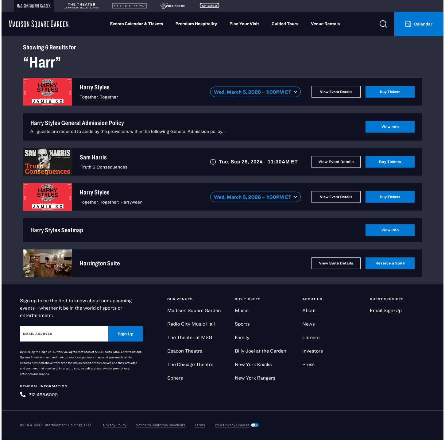

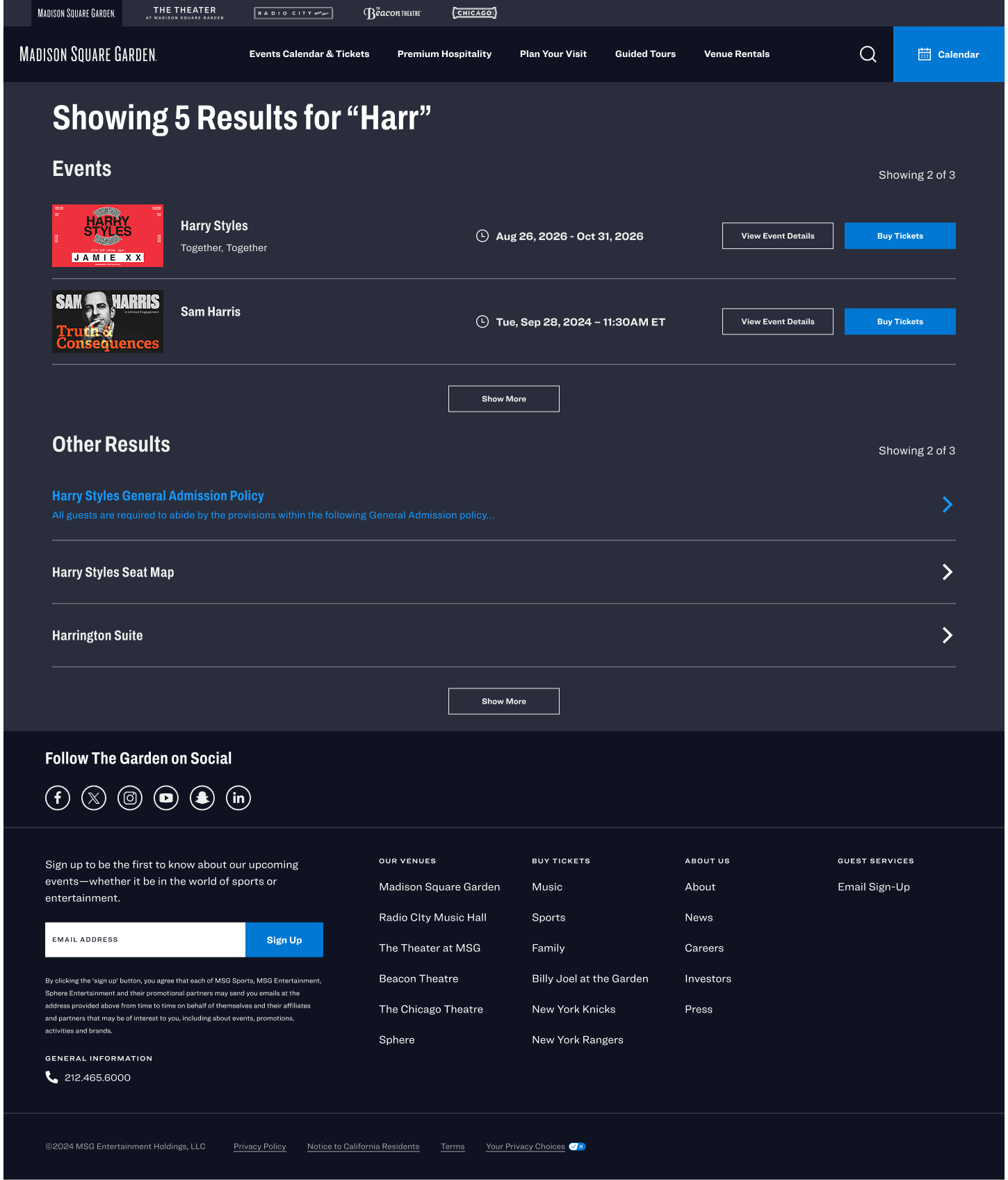
The main stakeholder who would be approving the changes wanted to have the search results separated because on the current site at that time the results were separated into events and landing pages like FAQs, seatmaps, food and beverage, etc. I pushed back arguing that this would lead to a more confusing experience, but she insisted that that was what would be best for the company and to sell tickets, by giving more visibility to events.
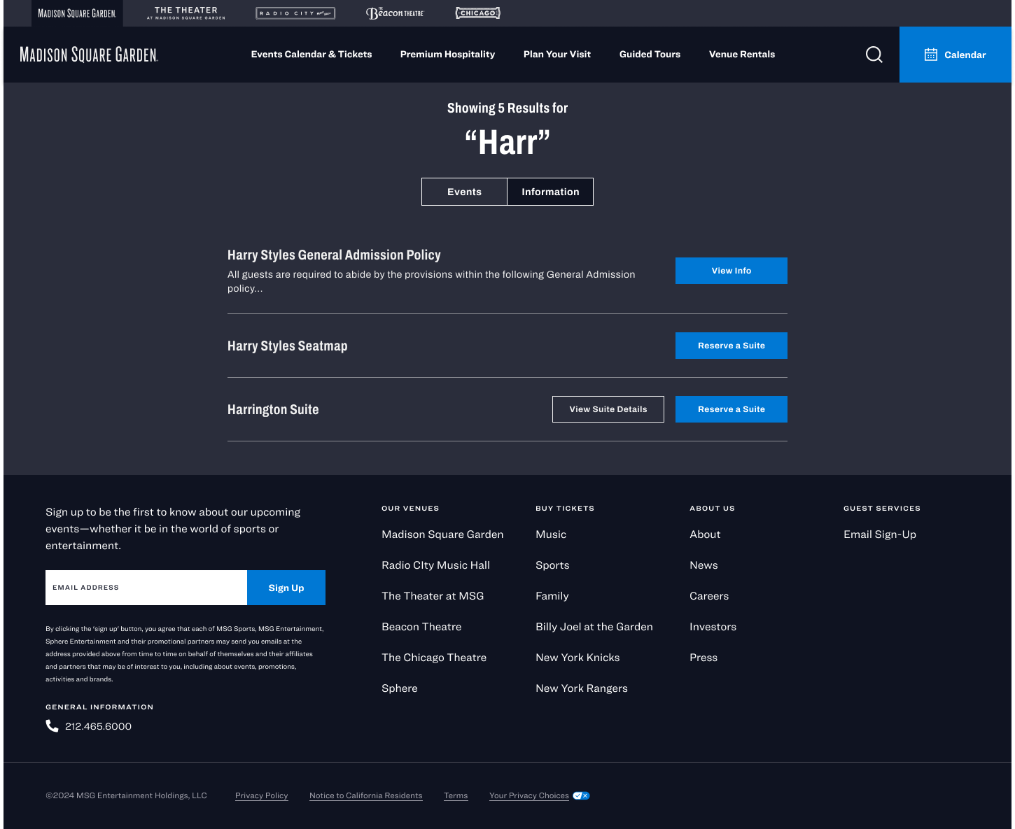
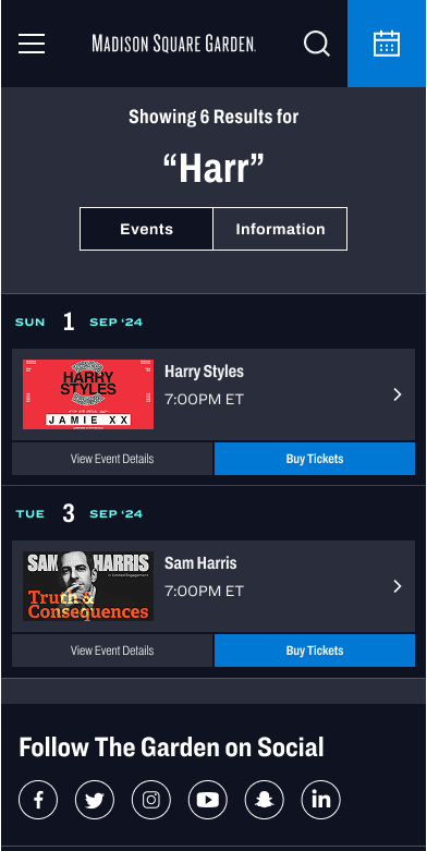
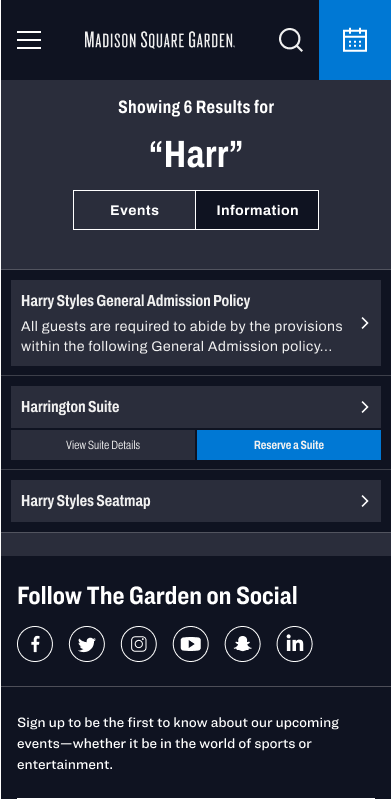
I then explored two options for the search results page. V1 which had a switcher between events and general information landing pages, and V2 which had events listed on the top, and the general information landing pages listed below. They preferred V2.
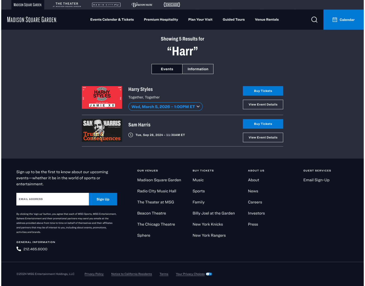
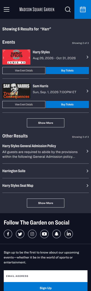
If we had still had user research, I would have liked to have tested these designs with users to see if there was any confusion with the experience, especially around separating the search results into two different categories.
The experience is now live on the website. To use it, click here and click the search icon.